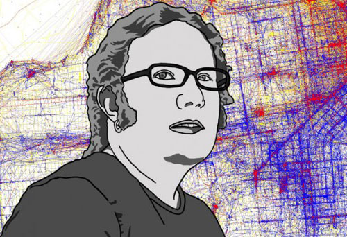
 For Eric Fischer, it all started with a trip to the University of Chicago library. It was, for him, a typical visit. He was there to research the origins of the modern keyboard layout. Not for a class, or even a master’s thesis, but just to know.
“Here’s one of these artifacts of life that has a very arbitrary arrangement, and somebody made a decision for it to get this way,” he explains. While trying to solve that mystery, his eyes wandered.
Shelved across from the books on typewriters sat volumes about public transit. He opened one to find old maps and photos of the Union Loop portion of Chicago’s “L” train, and was immediately captivated by the system’s legacy. Later that year, when the transit system celebrated its centennial, Fischer ran to the nearest bookstore to special-order the hefty commemorative book. “I just had to get a copy of this thing,” he says.
After that he was hooked on maps — for Chicago, where he went to college; for the Mission, where he lived for six years; and nowadays for the world.
The 37-year-old, who works for a technology company, has become increasingly well-known for his hobby as a creator of maps and curator of illuminating, often quirky, bits of transit history.
Fischer’s maps have been called art. People who see them on Flickr comment on their beauty, marvel at their intricacy. Many ask for prints to decorate their walls.
These maps transform real-time Muni bus arrival data into a dynamic time lapse of marching ants, a birds-eye view of a day in the life of San Francisco transit. They weave a world’s worth of geo-tagged photo data, which detail the time, date and location of photos taken with location-aware cameras, into digital streams of red, yellow and blue, cleverly laid over city streets to sift the tourists from the locals in a given place. They plot census data into colorful blocks showing the stark outlines of racial divide in America’s largest cities.